
News and media
26 Feb 2026
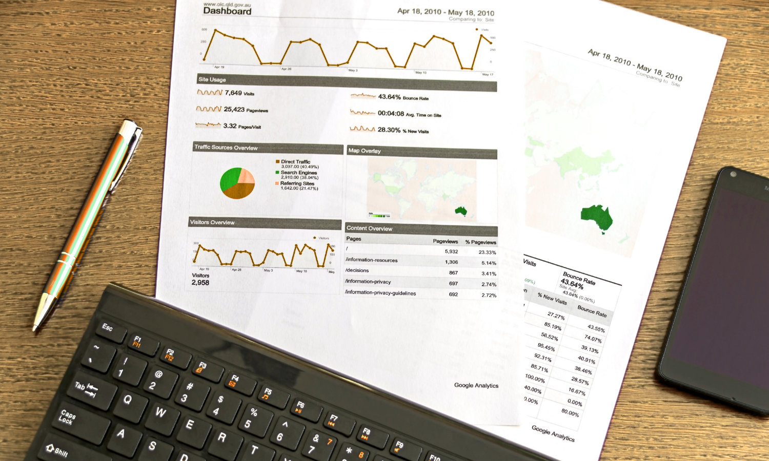
Many organizations do not realize how much faster and more accurate their decision-making would be if they had better control over data visualization. Without powerful tools, information managers will find it increasingly difficult to make sense of all the information they hold. Today, the analysis process is like a storytelling exercise. And relying on interactive and reliable dashboards is essential.
Undoubtedly, the role of the dashboard is to synthesize data to better manage an activity. In the field of Market Intelligence, the best-known deliverables are newsletters, email alerts and reports. But depending on your project and the typology of the stakeholders in your organization, these deliverables may not be suitable. Email alerts and newsletters are good deliverables in a “push” communication style, but they remain limited in terms of interactivity and analysis.
Cikisi has developed dynamic deliverables by offering customizable dynamic dashboards for your data sets that can guide decision-making through Data Storytelling.
Visualizing large amounts of data saves time when it comes to detecting new trends, identifying new entrants, applying technology to a new sector, or spotting certain market anomalies. Facilitating access, manipulation but also reading of data helps to achieve closer collaboration between the business intelligence unit and the various departments. Data Storytelling helps bring data closer to its users and helps them make more informed and relevant decisions.
Dynamic dashboards are a valuable tool for market intelligence. They enable companies to effectively monitor their ecosystems, make intelligent decisions in real time, and share graphical data with other team members.
However, dashboards are only visualization tools. The upstream steps are also important, as is the monitoring tool associated with the data flow presented in a dynamic dashboard. This must be chosen and implemented with your objectives in mind.
Dynamic dashboards add a new perspective to your data analysis. On one hand, they make it easy to track market trends, competitors, regulations as well as new entrants… But these analysis tools also help you take a step back when making decisions. Before choosing such a tool, make sure it has the following 4 features.
As its name suggests, a dashboard must be able to display data in a dynamic and interactive way. The user has the possibility to interact with the graphics according to his/her needs. The graphics must therefore be linked to filters such as date, geolocation, entity or even technology that have been extracted from the documentation database.
It is just as important for a dashboard to be reliable and comprehensive. The data it feeds on must be accurate, up-to-date and from verified sources. This ensures that users trust the information displayed on the dashboard, and this is why the Cikisi platform provides complete transparency on the data collection process.
Then, to be effective, it must be easy to use and intuitive. Users can easily navigate the dashboard and find the information they need quickly. The visualizations are clear and the dashboards are easy to understand.
Dashboard customization is also key to the success of this type of tool.
For our customers, customization affects the data. Cikisi dashboards can handle heterogeneous data formats (news feeds, documents, external widgets, newsletters, images, text…).
This facilitates closer collaboration between business information managers and teams closer to the decision-making process. Indeed, in the right format, data can be adapted to the needs of each department within your company.
All data visualization relies on the documentation database. That is why it must be as qualitative, complete and correct as possible. There is no good data visualization without good data.
Cikisi allows you to obtain information from sources known to business intelligence professionals, as well as sources that are unknown because they are not referenced by traditional search engines.
To do this, Cikisi’s web robots scan the visible and deep web every 60 minutes to quickly capture any changes and updates that have taken place. When you enter your topic into the platform, it will automatically launch a search of the visible and deep web.
The business intelligence officer then has access to all this information through his/her search engine or AI, Ask Mila. The information enriched with new data collected by Cikisi technologies is then structured and capitalized to enable you to communicate and analyze it more finely.
Coming soon to Cikisi: the addition of the IXXO thesaurus, which facilitates content analysis and documents classification.

Cikisi’s dynamic and interactive dashboards enhance your data sets. They give meaning to data by bringing it closer to its end user and their informational needs. But they also facilitate its interpretation and manipulation through Data Storytelling.
Data enrichment processes, connected to our core business, Web Mining, allow you to obtain interactive, reliable and comprehensive data in real time. Our dashboards provide a dynamic and intuitive visualization of the data collected to disseminate information where it is needed.
Want to discover it?